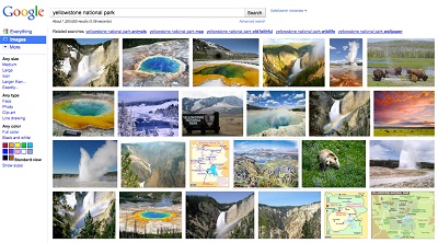
After years of refining its specialized search engine that sweeps the Web for images instead of text, Google is launching a brand new version of Google Image Search that provides more results in an easier-to-use interface.
Currently, when users search for an image on Google, the results are brought up in a 3 x 6 array, providing 18 results per page. The new version will be able to show dozens.

Google achieved this by cutting out all the ambient text around the images, such as the image’s file type, pixel size, and source Web site. The new image search gets rid of all that and squeezes the images together so users can get a much better snapshot of the results found.
“Once you click on an image, you’re taken to a new landing page that displays a large image in context, with the website it’s hosted on visible right behind it. Click anywhere outside the image, and you’re right in the original page where you can learn more about the source and context,” wrote Google Images project manager Nate Smith on Google’s official blog.
Additionally, mousing over an image will provide more details about it without users needing to click it, and the results will automatically expand when users scroll down, meaning no more need to click on the “next page” link.
The updates have already rolled out on a very limited basis, and Google will continue to integrate the new search design across all Internet users over the next few days.
Previous enhancements to Google Images since the feature first launched in 2001 include the ability to filter results based on size, color, and the type of picture (“face,” “clip art,” “line drawing,” and “photo”).


Google appears to be focusing on segmentation by organizing around “circles,” allowing an easy way to target particular posts to friends, family, colleagues, etc. In fact you can do this on Facebook as well, but Facebook lists are not as easy to find or edit; nor are they as easy to view as a separate stream.